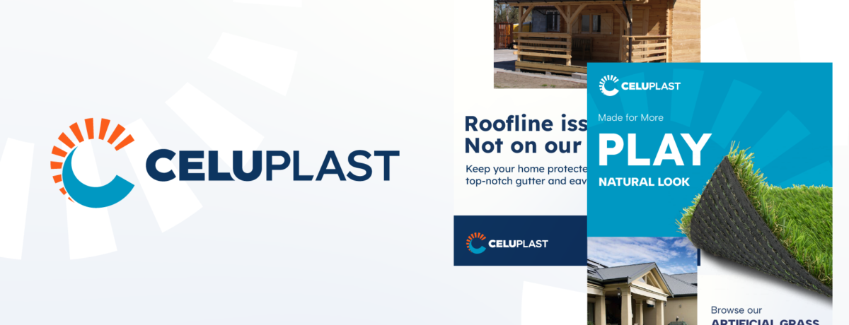
While Celuplast is one of Dublin’s leading trade counters, its visual identity no longer reflected this. Celuplast were keen to create a brand identity that fully reflected the current strength and position of the business, as well as the quality of service it delivers.
We were immediately inspired by the bold direction of their ongoing marketing campaigns at that time, and recognised the need for a more consistent, confident visual identity that would better align with their recent approach. With our wide experience working with construction, building products, and trade-focused brands, we identified the areas where we could strengthen Celuplast’s branding, without losing their long-standing recognisability across existing customer touchpoints.
With their logo lacking flexibility and visual cohesion, it was limited in how it could be applied across different formats, making it difficult to support future brand architecture. The logotype also struggled with legibility at smaller sizes and did not fully capture the personality and confidence expressed elsewhere in the brand. With this in mind, our design team executed a subtle, but impactful rebrand that would represent the business more effectively while aligning all elements of their visual identity much more cohesively.
Our approach began with a brand discovery workshop that would discover the core brand purpose, persona and values, while helping to establish a new, more relevant tone of voice. This is also where we began to evaluate the current logo alignment and introduce new ideas of where the brand should go visually.
The brand discovery workshop included:
From this initial discussion, we had a much more informed idea of how Celuplast wanted to be perceived by their audiences and developed a new brand that would better position themselves in the market. Understanding that Celuplast wanted to remain recognisable to their existing customer base, our approach focused on evolution rather than revolution, retaining the most recognisable elements of the existing identity while refining and strengthening them for greater impact.
We started by refining the original logomark into a perfectly balanced circular form to create a stronger visual alignment, opening up new opportunities for application across signage, print, digital platforms, and future brand extensions. This subtle adjustment improved the brand’s versatility without losing its longevity and familiarity.


Alongside this, the logotype was redesigned to develop a more distinctive and confident character. With increasing the weight of the font, refining the spacing, and including bespoke detailing, we were able to create a new logotype with more personality that stood out while fitting in with similar approaches from competitor brands.


The colour palette also evolved, using brighter, more saturated brand colours that would support greater flexibility across light and dark applications. The refined palette balances approachability and energy with trust, authority, and expertise, creating brand colours that perform effectively across a wide range of customer touchpoints.

Celuplast received a modernised brand identity that better reflected the company’s priorities and its position as one of Dublin’s leading trade counters. The refreshed identity provides a stronger, more confident presence in the market.
Supported by comprehensive brand guidelines and a complete suite of branded assets, the Celuplast team now has the tools and framework needed to apply the brand consistently, strengthen customer perception, and maximise the impact of future marketing and communications activity.