Every brand reaches a moment where it pauses, looks at its current branding, and realises it’s grown in ways the visuals haven’t quite caught up with. For us, that moment arrived quietly. Not with a dramatic brief or a sudden shift, but through the everyday conversations about our branding as a team. We discovered hints that the way we were showing on the outside didn’t fully reflect the PR and marketing consultancy we were on the inside.
After reviewing our mission and values, we pulled apart the pieces of who we are and examined them with honesty and curiosity. What concluded wasn’t a need to reinvent the wheel, but to reconnect our visual communication with how our brand shows up in practice. To have our visual identity reflect the values, principles and purpose that drive us every day. Most of all, we needed a brand refresh that felt like us again.
The Challenge
Since our last rebrand in 2019, we’ve grown into something bigger. We’re a consultancy built on expertise, transparency, strategy and integrity. But, amongst the busyness of a growing client portfolio, our branding had stopped keeping up with where we were heading.
So, we went back to the beginning. We asked ourselves questions:
What’s our mission now? What do we stand for? How are we perceived in the room? Do we reflect our business, our team?
Those conversations became our guide. They allowed us to rediscover the personality that had been there all along and gave us the clarity we needed to start shaping a visual identity that felt like a true reflection of Smith Goodfellow now.
The Big Idea
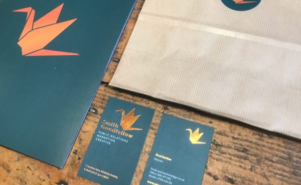
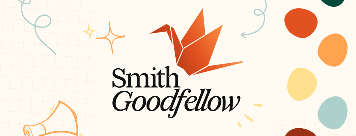
It was clear we didn’t need to reinvent ourselves. The core of our identity still felt true. Our trusty crane logo is well recognised, with the concept behind it still very much reflective of who we are, as with the general feel evoked by our colour palette and typography.
But when we reviewed how the visual brand behaved across the business, that’s where things felt limited, as if we had outgrown our own toolkit. Our current assets and applications didn’t give us enough room to express what we do.
What we needed was a refresh. A chance to refine, not replace.
One area that came up both in team conversations and client feedback from our latest Impact Report related to three of our key values: People-first, Collaboration, and Integrity. This refresh became our chance to better reflect that: to show, not just say, who we are. To build a brand that works with, for, and alongside.
With this, the ‘big idea’ split into two goals:
- Enhance what we have.
Our core identity still felt true, it just needed refinement to express our values more confidently. To strengthen our values and personality in the form of visual creation. - Build a flexible design system.
Something that felt professional and reflects our expertise, but human and warm when it mattered most. A system that could stretch across high-grade technical documents, digital marketing, internal communications, and everything in-between.
What Changed?
Sharpening the fold
The crane really sits at the heart of who we are. A symbol that is recognised instantly and one we’re deeply attached to. So, the first decision was easy; the crane stays! However, although the former crane is a beautiful illustrative piece of work, to allow it to be better proportioned for other applications or alongside other brands, we needed to refine it just a touch.
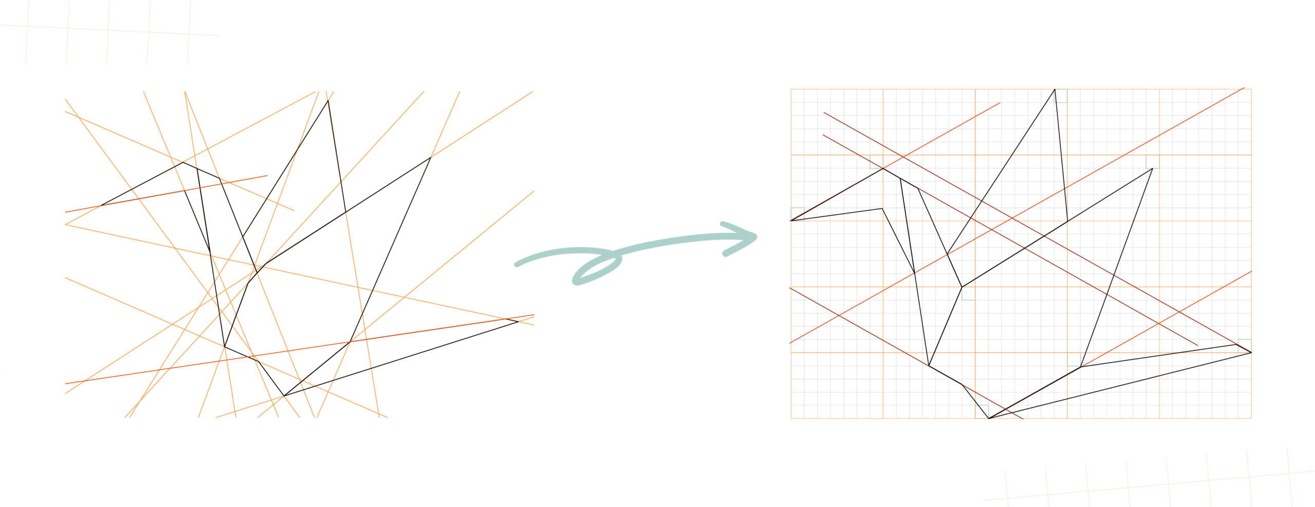
With minor adjustments, our logomark is now confined within a rectangle with all points of the crane aligned within the grids, allowing opportunities to centralise within any shape and build refined guides on placement and white space. The consistent parallel lines which allow better recognisability at a distance.
![]()
The crane is a recognisable part of our identity, but we knew our name needed to carry that same strength and personality. The Smith Goodfellow name, what we call a “wordmark”, brings a confident, recognisable style of its own, while also giving us greater flexibility across different applications.
This means we’re no longer reliant on using the wordmark alongside our crane to be recognised – each element can stand strong on its own, while still working seamlessly together.
Finding our type
As a business whose roots lie in the written word, typography is a core part of our personality. We kept our existing fonts–they still feel right and were chosen for clarity and editorial leaning. But we wanted to introduce a new layer of humanity, something that reflected the way we work: collaboratively, curiously, side-by-side with our clients.
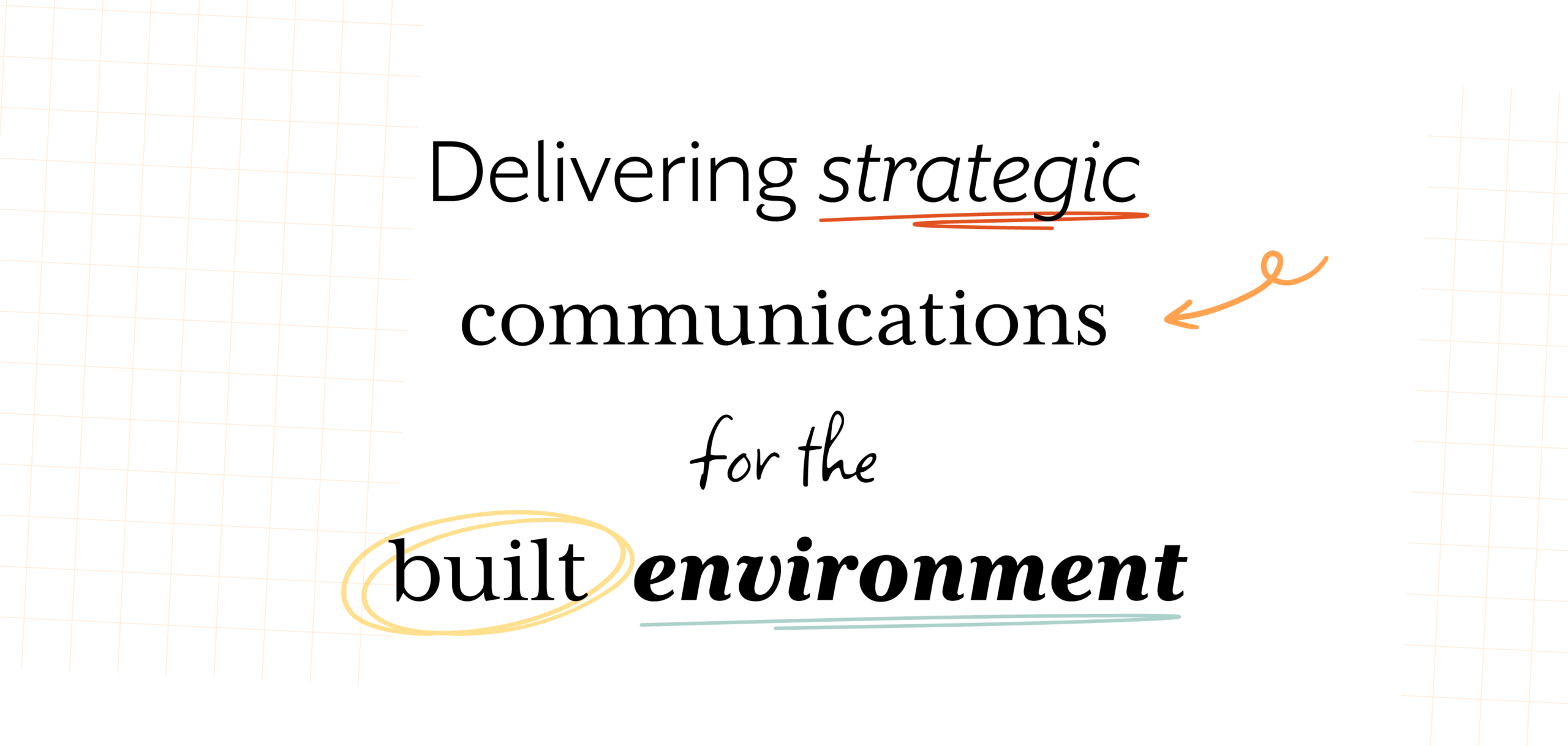
That’s where the handwritten accent type comes in. It’s expressive without being messy, warm without being informal. It feels like the notes we scribble during workshops, the ideas we circle on whiteboards, the annotations that spark conversations.
A splash of colour
Our copper orange and green have become part of our visual DNA and honestly, we love them too much to change. They’re confident, warm, and unmistakably “us”. So, they’re staying exactly where they belong.
But as we explored our values more deeply, we realised the palette needed room to grow. People‑first, Collaboration, Integrity – these aren’t just words, they’re tones, moods, energies. To express them fully, we introduced four new supporting colours.
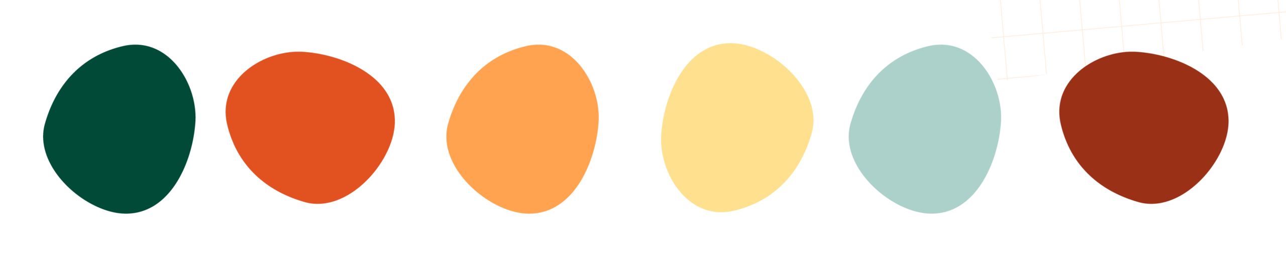
These additions sit within a clear structure of primary, secondary, and accented tones. They complement the existing palette while giving us more flexibility across different types of communication. Reports can feel grounded and authoritative, social content can feel vibrant and human and internal documents can feel warm and welcoming. This expanded palette gives us the freedom to express the full scope of who we are.
How it applies
Applying these newly refined elements together creates an exciting opportunity to express our personality in a more engaging and consistent way, from illustrative icons to bold use of colour and structure.
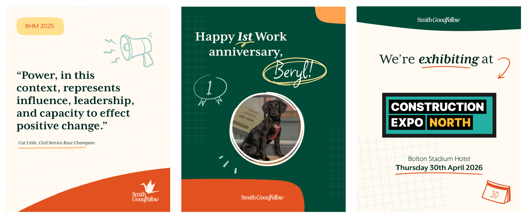
Once more, with a flexible yet clearly defined design system in place, we now have the tools to adapt confidently across a wide range of applications–from formal documentation to social media and digital content–without losing cohesion.
The Impact
As we step into this exciting new chapter, the refresh feels less like a change and more like a realignment. An opportunity where our visual language finally matches the way we’ve been working now and where we’re going next. The new system gives us room to grow, adapt and communicate with clarity, without losing the warmth and integrity that define us.
Our team have an enhanced toolkit that now supports rather than restricts. A system that works for detailed reports, energises our digital presence, and brings a more human tone to the conversations we have with our clients and partners. It’s a brand identity that can scale with our business aspirations and feel human in the moments that matter.
By embedding our values into a visual landscape, we’re making a commitment that goes beyond design. It’s a promise to stay open, curious and connected. To continue building relationships rooted in trust and shared purpose. We are excited to see how this identity grows with us — how it evolves through new projects, new partnerships and new challenges.
Most of all, we’re proud to have created a system that feels unmistakably “Smith Goodfellow”: trusted, collaborative, human, and ready for whatever comes next.
If you found this blog helpful, have a read of our previous design insight ‘Redesign vs Rebrand – Which is right for you?’.
You can also learn more about our branding journey in ‘Smith Goodfellow: A branding backstory’ and ‘Smith Goodfellow: Building the new brand identity’.
Liv has been part of the Smith Goodfellow team since February 2024 as our Creative Lead.