In today’s fast-paced world filled with multifaceted information and complex content, capturing the reader’s attention for a long stretch of time is a challenge. But how do you present lengthy pieces of information, such as technical research or surveys to in a way that ensure the key message in your data doesn’t get lost in the void of black-and-white text? How do you become confident that your data is memorable and engaging to the reader?
Infographics are one of the most powerful methods for transforming these insights into something engaging, easy to consume, and memorable. This blog explores how infographics can serve as a key asset in sharing knowledge or data through impactful visual storytelling.
How does the human brain process complex information?
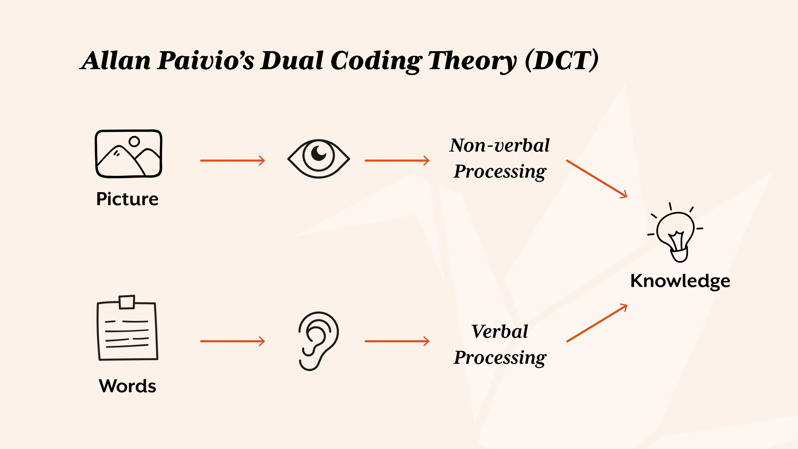
The effectiveness of infographics in conveying complex information can be traced back to psychological principles rooted in cognitive science, particularly Allan Paivio’s Dual Coding Theory (DCT). Paivio states that there are two subsystems active in our thinking, verbal and non-verbal, which can function either independently or together. The verbal system specialises in language such as reading, and the non-verbal specialising in non-linguistic objects and events such as images. For example, when we begin to learn mathematics, we typically first encounter numbers as symbols or words (the verbal channel), but true understanding often comes when these symbols are paired with visual representations, such as counting blocks, groups of items, or images (non-verbal channel). Similarly, problem-solving such as additions or subtractions were once taught on an abacus to visually understand the calculation.
The benefits of infographics based on Paivio’s DCT go hand-in-hand with John Sweller’s Cognitive Load Theory (CLT). CLT states that the human working memory has limited capacity which can easily become overloaded when processing complex or dense information. Infographics support this mental burden by:
- arranging information in a visually intuitive way;
- sectioning it into manageable pieces; and
- guiding the viewer’s attention to key insights.
This not only reduces the mental cognitive load but also enhances learning efficiency and notability.
This research highlights a key principle; information presented in both verbal and visual formats is more likely to be understood and remembered, reinforcing why infographics are so effective. This visual format combines data, text, and imagery in a cohesive layout that engages both cognitive channels. By combining both DCT and CLT theories with the goal of capturing and holding the audience’s attention, infographics can support in transforming information-heavy material into content that is not only accessible, but also engaging and memorable.
How does design capture attention and boost engagement?
The creative method in visual presentation of information is everywhere and has been for a long time, from Egyptian hieroglyphs to online survey results. As creatives, our role goes beyond decoration. We are storytellers, strategists, and communicators. Whether the goal is to inform, persuade, warn, or simply engage, we are briefed with turning plain, black-and-white data into compelling visual narratives using design principles such as colour, contrast, layout and more. We give form and meaning to information that might otherwise be overlooked or misunderstood, and for larger pieces of data or information, presenting in the form of infographics can come in handy.
In today’s digital age, tools like PowerPoint and Asana have made it easier than ever to transform basic data into charts, graphs, dashboards, and other visual formats. While these tools are incredibly useful to show information at a glance, they sometimes lack in delivering the human touch, creativity, and purposeful design, especially when not all the data is relevant to the viewer or when key messages get lost in a sea of flashy interfaces. The true power of an infographic lies not just in its visual appeal, but in its ability to communicate complex information with clarity, efficiency, and impact.
Now it wouldn’t feel right to discuss the power of infographics without mentioning the designer known as the “Galileo of graphics”, Edward Tufte. Holding both a B.A. and M.S. in Statistics from Stanford and a Ph.D. in Political Science from Yale, Tufte has dedicated much of his career to advocating the thoughtful and ethical visual display of information. His book, The Visual Display of Quantitative Information, is a foundational read for anyone working with data visualisation. His recommendations express clarity, precision, and efficiency, urging creatives to minimise unnecessary design clutter and let the data speak for itself. His influence continues to shape how we think about the combination of data and visual communication in a time saturated with information.
The true strength of infographics falls in the design’s ability to bridge the gap between complexity and clarity. When done well, an infographic doesn’t just look good, it helps the audience understand the context more easily, leading to faster decision-making and more effective storytelling.

What are the best practices for designing effective infographics?
There is more to it than just making the data look pretty. An effective design requires an understanding of your audience, as well as strategy, clarity, and function. Here are three general best practices:
Keep it simple with design in mind
Data converted into a visual element needs to be focused and with a clear message or theme. Choose minimal text, specific language and visuals which support the core thinking. If the infographic is connected to your brand, use your own brand elements to help viewers link the two. Create hierarchy and use elements to highlight specific points.
Use accurately sourced data
If your information is based on a company survey result, you will likely have accurately sourced results to create from. However, with outsider sources, ensure your information is credible and cited from a trustworthy source. Inaccurate or over-exaggerated information can undermine the design’s impact.
Choose the right visual format
Like the Dual Coding theory I explained earlier, readers will connect visuals to text subconsciously. Research into what viewers would typically visualise when seeing that information. If it’s location-based data, create a map; if it’s chronological, create a timeline; if it’s a checklist, create a clipboard; and so on. Every element of design implementation should have a purpose to it. Design should not overcomplicate or overpower the data provided.
What common infographic design mistakes should you avoid?
Even the best infographics can fail if they fall into any of these common traps:
Information overload
Data visualisation is there to help viewers absorb the complex information provided, the design itself should not be complicated and certainly not overwhelm the viewer. Try to avoid packing too much information into one graphic. Break large topics into a series of infographics if there is too much information to put into one visual.
Lack of context or narrative
Although an infographic is there to present data visually, it still needs some text to provide context. Include a title, brief introduction, and a short conclusion or CTA if needed. Help the viewer understand why the information should matter to them.
Inaccessible or inconsistent branding
Infographics are a key element in design, so the design of it matters. Tiny text, low contrast, and overly complex visuals hinder accessibility, and if everything is the same size, colour and weight, nothing will stand out. Try to avoid cluttering the graphic, establish a clear visual path for the viewer to follow. Stick to your brand’s style guide if one exists. Read more about in Gov UK’s ‘Dos and don’ts on designing for accessibility’.
How do you design infographics that clearly inform and educate?
Infographics aren’t just decorative; they are a powerful communication tool that can transform how your target audience absorbs information. The use of infographics is an effective way to bridge the gap between dense information and visual understanding, using science, creative thinking, and visual hierarchy. A well-designed infographic turns complexity into clarity, and information into insight.
Want to make your data or complex information stand out? Start with a well-designed infographic. Or better yet, let us help you create one. Get in touch today! If you’re interested in reading more graphic design content, visit my ‘Redesign vs Rebrand’ blog next.