British Spirals & Castings logo

British Spirals & Castings – Rebrand and website development

The British Spirals & Castings’ rebrand aims to convey the company’s commitment to high quality and craftsmanship to architects, interior designers, and other specifiers, while continuing to appeal to homeowners.

Challenge

Since 1992, British Spirals & Castings (BS&C) had built a strong reputation for manufacturing bespoke staircases, railings, and balconies for buildings and homes around the world. During the pandemic, BS&C saw an influx of orders from owners looking to make improvements to the properties they were spending their time in, followed by a natural drop in overall volume as a result of a variety of factors, including significant inflation and economic uncertainty. To ensure a healthy project pipeline, they were looking to refresh their brand and website, creating a design-led presence which communicated their focus on quality, service and craftmanship. The challenge was to do this in a way that would appeal to both professional audiences, such as architects, interior designers and developers, and homeowners.

Solution

We guided BS&C through a comprehensive rebranding process that included building a new visual identity and a website with a modern style and improved navigation. This process included a detailed analysis of the target audiences, market research on other high-end bespoke manufacturers and other brands frequently visited by architects, designers, and other specifiers.

Brand Identity Development:

Our first step was to understand the impression BS&C wanted to make. Through collaborative workshops, we uncovered key insights:

  • Visual identity: The client wanted a visual identity that conveyed quality and craftsmanship. The spiral staircase, their central product and visual motif, became key to the design. Brands like Villeroy & Boch and Smallbone influenced the final aesthetic: premium and heritage-rich, yet modern. The overarching visual identity focuses on the quality, expertise, and craftsmanship of BS&C.
  • Logo: We designed a refined logomark that was unique with an ownable identity, and that carried the feel of a ‘stamp of approval’. The lower half of the logomark represents a spiral staircase wrapping around a central pole, while the upper half hints at the head of a railing. This logo delivers a nod to both craftmanship and expertise, positioning BS&C as a long-serving, quality-assured business. The logomark is paired with a classic serif typeface, evoking sophistication and confidence. We also incorporated the company’s establishment date to emphasise its longevity and expertise.
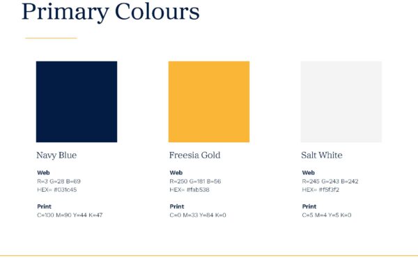
  • Colour palette: The updated palette evolved BS&C’s distinctly British branding into a subtler and more timeless scheme that still reflected the importance of British manufacturing. To celebrate British heritage in a more understated way, the ‘Made in Britain’ mark was prominently featured on the new website. The new palette was carefully selected to reflect the company’s values:
    • Navy Blue: Symbolises longevity, reliability, and trust. Deeply associated with British heritage and craftsmanship.
    • Gold (Freesia): Promotes luxury and success. Its reference to the Victorian symbolism of the Freesia flower also highlights trust and prestige.
    • Salt White: A soft, refined alternative to stark white, chosen for its balanced, complementary tone that allows the other colours and product visuals to take centre stage.
  • Typography: The typographic system used a mix of serif and sans-serif fonts to strike a balance between classic and contemporary. Ultimately, the fonts supported the visual identity in communicating trust, expertise, and the brand’s high-end positioning.
  • Tone of voice: We helped shape BS&C’s brand language to reflect their pride in local craftsmanship, commitment to service, and strong communication – values that appeal equally to design professionals and homeowners.

Website redesign:

To bring the rebrand to life and improve customer experience, we worked with our creative partners at Platform 81 to design a new website tailored to BS&C’s new audience:

  • Enhanced quote form: The updated form was created to help lead users through the quote process in a more visual manner, making it faster and simpler.
  • Wishlist feature: A new tool for customers to save and submit inspiration images directly to BS&C, making it easier to get their vision across.
  • Streamlined navigation: The new structure makes it easier to find relevant information. Products are organised into clear categories (spiral stairs, straight stairs, balconies, balustrades, cast iron store) with pages giving a clearer sense of the different design options available for each item.  Case studies, blogs, and the gallery are under a newly introduced “Inspiration” section.
  • Visual presentation: The overall design is image-led, placing craftsmanship and design at the forefront to resonate with the creative community.
  • Narrative journey: The content was simplified to let the design and imagery take focus, while still preserving BS&C’s established voice as expert artisans. Serving as a gentle guide, the text supports the customer journey with a cohesive narrative that enhances clarity and engagement.

Results

The rebrand has successfully repositioned BS&C as a trusted partner for architects, interior designers, and other specifiers, while continuing to appeal to homeowners. The refreshed brand identity and website now deliver a refined, design-led presence that communicates craftsmanship, heritage, and modern sophistication.

When comparing the requested quotes from Q2 2024 (pre-rebrand) to Q2 2025 (post-rebrand), BS&C saw a 52.33% increase in overall quote requests. Growth was particularly strong in two product areas identified as priorities during the rebrand – balcony quotes rose by 63.64%, and railings quotes surged by 218.18%. Evidently, the rebrand has attracted a higher volume of customers, and the newly developed website showcases product ranges that were previously unseen or unclear to audiences.

From this rebrand, BS&C has not only enhanced its visual identity and digital presence but also achieved tangible commercial gains. The combination of heritage, quality, and contemporary appeal has resonated with its newly expanded audience, leading to stronger engagement, better-qualified enquiries, and growth in quote requests for some key product areas.
British Spirals & Castings – Rebrand and website development

British Spirals & Castings logo

Guardian Building Systems – Initial 3-month Warm Roof campaign

Siderise EduComms Strategy – Award Winning PR

British Spirals & Castings – Foundry Video

Engineered Panels in Construction (EPIC) – refreshing an established entity

Speedpanel Social Media – Growing a Platform

Kingspan Light + Air Designing for Happiness at Work campaign – Industry Issues with a People Focus

British Spirals & Castings – Brand Unification

Speedpanel A2® Glass Campaign – Small Scale, Meaningful Impact

Speedpanel branding – launching a new brand into the market